Having recently reached the ripe old age of 40 in Australia, and now being eligible for the Pfizer vaccine here (we do not have enough doses right now go to go around), I immediately jumped on the Government website to search for a vaccination appointment.
What struck me as surprising, even given what I already knew, was how difficult they were making it for people to book.
On the one hand, the Government here is spruiking vaccines and steering us into it being the “only way out” or ideal path to freedom (rather than just ending lockdowns).
On the other hand, they do not make it easy to find an appointment. In fact, during the process I thought perhaps I’d have more luck sniffing out truffles in a field than getting a whiff of a vaccine.
So, what’s the usability challenge?
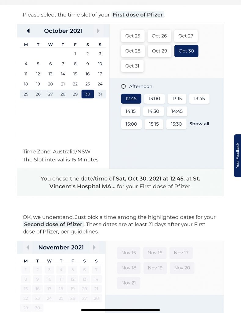
The system is undoubtably overloaded with an over-demand. Hope is raised the moment you load up the website, with a scattering of options coming up on various days.
But, at the time this writer looked into this, appointments were mostly available at the end of November. And with this system, you’re required to book your 2nd dose at the same time as your first dose.
But, you can’t book your second dose as there is nothing loaded in November, so, there is nothing available in 3 weeks’ time, so, there is no option to make a 2nd dose booking, so, you can’t book your first dose.
So while the system allows you to search for and select a first date, you can’t select a second date because it doesn’t exist.
So the purpose of posting availability for the first dose is kinda pointless because the system doesn’t let you do anything at all useful.
Why not just annoy your website users and send them in circles?
The intention with web usability is to make it easy for people to do various different things on your website, let’s call them goals or conversions, and give them multiple ways to do that and make it easy for them to do that.
Instead, what this system does very well is send users in a continual loop of checking dates that are available for a first dose, only to find they are not available. To then select another date, only to find there is no availability for a second jab and therefore the whole exercise is pointless.
What we have done in this exercise is invest a lot of money into sending them to a system which is functionally useless for the purpose (at the time I write this). Because any date you select in this system at the time I checked, is going to result in a failed outcome.
It’s a bit like paying for Adwords to send people to your website, but you didn’t improve your website for that purpose.
Sure, you can argue that there are limited doses, etc, etc, etc. But what is the point in sending me all the way here, when I cannot take any actions?
Comparing to the competitor software – Hotdoc
I have no shareholding or other interests in this system, but I absolutely love the simplicity of Hotdoc. It has to be one of the best systems out there for Keeping Things Simple, so we can get on with our lives. Booking a doctor appointment for myself or family member is so easy on this system, requires very little thinking. And so I wasn’t surprised with their better system.
In getting very frustrated with the Government system I moved on to Hotdoc after a recommendation. It’s fair to say I did get impatient with this too and gave up pretty quickly (I am talking, in the minutes). So with some tips from friends and a bit of time up my sleeve I persevered and tried again a few days later.
Here’s how it’s instantly better:
- Hotdoc already knows who I am when I get there – I don’t need to identify myself and answer a tonne of multi choice questions. Saves a whole lot of faffing about.
- They let me search by nearest to me or soonest appointment – I have some choice to decide if I want something closer, or sooner. I’m happy to travel to get this thing, so, if it saves me a month I’ll drive! If I can’t be bothered moving far from my chair, I’m also covered. It’s actually a very simple feature, but adding dimensions to your website experience makes it easier for customers to connect with you.
- I can see likely wait time – Next to each clinic, it tells me possible timeframes – are we talking 3, 7 or 30 days? This info is there, up front, I can act on it. A fancier term is “actionable insights”. After all we want people to do this right so why make it hard?
- Most importantly, I always seem to have an option for jab #2 – When I book with someone showing availability there always seems to be an option for the second booking, so I am not going in and out of various options as much.
Improvements to make
Not having enough “stock” is a poor excuse to sending the customer to a dead end.
To that end, there are a number of improvements that could be made here:
- Give people dimension to their choices – I should be able to search on different variables, not just poke around and waste my time.
- Don’t waste people’s time if you want them to convert ie take an action – If you make it difficult for people to take the actions you really want them to, do not put up barriers to that process. And if you can’t tell whether you are, ask us or your web usability person!
- Automate the process – Something like this is so important to get right. How can you create processes which lead people where you want them to, in a much better, easier way. I go into more detail on this below.
Automate the process!
The fundamental concept of automating the process here, is removing as much manual intervention as possible, to create something which is as automated as possible.
The vision I’d have for something like the vaccination process, where many people will get it but where you want to maximise that (ie, maximise conversions) and you wish to do that as quickly as possible, is automation.
There are many great avenues for automating the process of lead generation in the case of business, but here what I’d have liked to have seen is something like this:
Step one – Keep it simple, let me register for the jab first off the bat
Here, I’d want to demonstrate how easy it is to get a vaccination by:
1) Allowing me to select whether I want something closer to me, or sooner in time.
2) Giving me an estimated jab date on that basis. It doesn’t matter if it’s entirely accurate, but, it communicates something valuable to me.
3) Take me to the registration page.
Step two – Time for the boring stuff
Yep, we need to know who you are now and give you a multi choice question. But by now we’ve already sold you on the vision, how simple it was to get a booking (even though you don’t have one yet) and so you’re primed for the next steps and not too fazed by them.
Step three – Reinforce the vision and inspire me
Now you’ve given me some motivation and the boring stuff is over, let’s give some simple motivation.
-You’re almost there!
-Thanks for registering for this super important thing!
-Thanks for making it this far through our mundane multi-choice!
-This is when we expect to jab you, approximately, at this location (the date range should be broad if uncertain so expectations set aren’t too precise).
Step four – Follow up and technical stuff
Here the Government has a predictive system which allocates jabs on a first come, first served basis, rather than a “Who had the endurance to sit on the website the longest” approach.
Regular communication with each registrant keeps them up to date with their booking, to continue to set expectations.
An email comes when it’s time, as well as an SMS.
If they miss the appointment/don’t confirm, that person is prioritised for a rebooking – so they are not waiting more months to get back in the queue.
To Summarise
What we want to do here is always make it as easy as possible for the customer. Coming back down to earth to a regular business, if you want them to take the actions with you, you do need to make that process simple with multiple pathways to action. And if you don’t make that process simple, you won’t get any action.
The Government website I visited was probably made in a hurry. It would be great to see more development here to simplify the process and substantially increase usability of the system.